Rathbone Homes
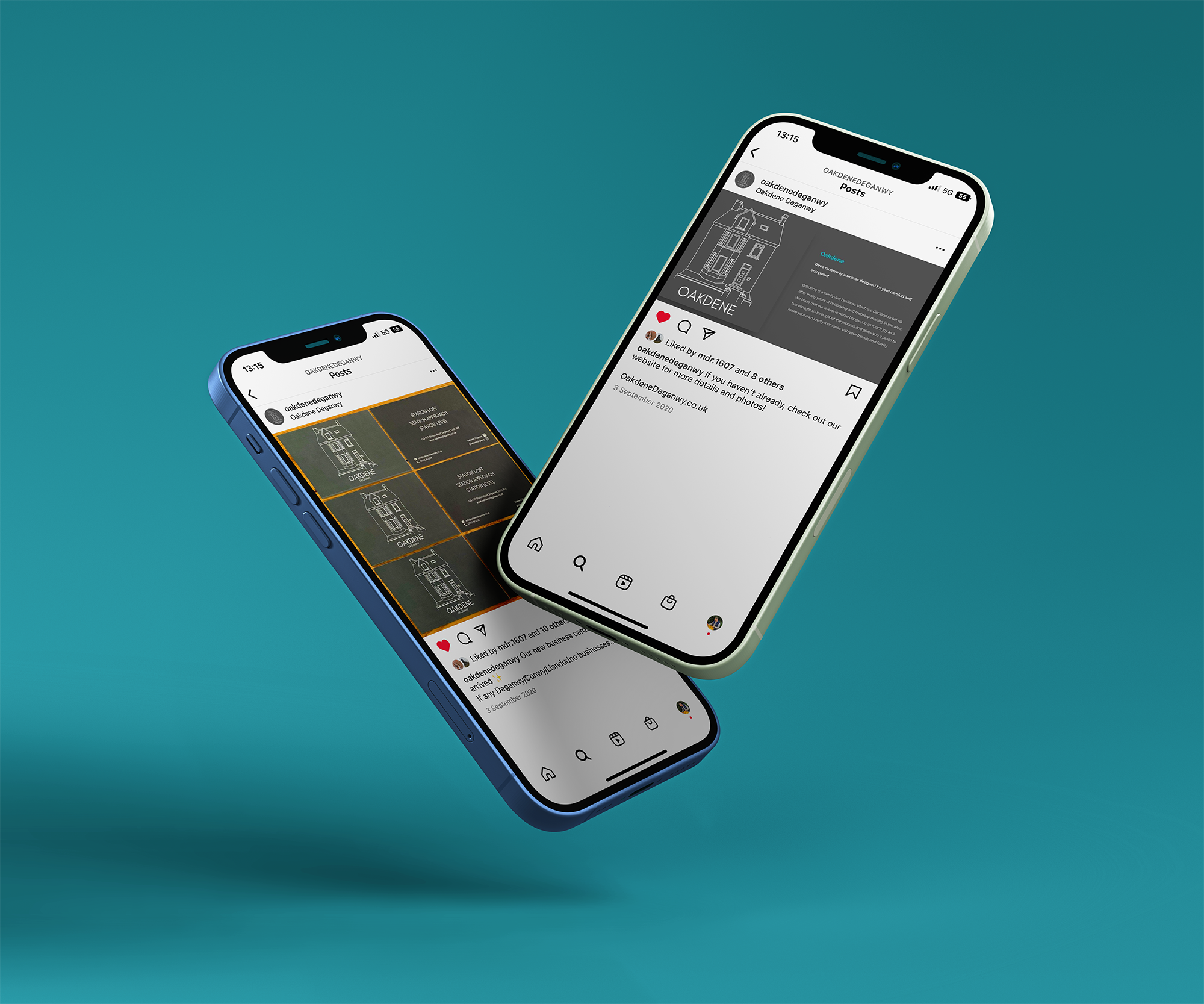
Rathbone Homes required branding and logo design for their newly refurbished ‘Oakdene’ collection of luxury holiday flats.
Simplicity was key, keeping the logo to a series of lines. A monochromatic illustration allowed the brand to evolve, dependant on requirements. The brand’s primary colour, and background for the main logo, a rich grey, lends itself to the modern interior style of the properties, whilst supporting the ‘timeless’ air of elegance that the logo oozes.
“…we’re over the moon with the new logo and colour scheme. We now stand out, above our competition and it really captures the character of our holiday lets…” - James Rathbone (MD Rathbone Homes)

